Client

Rithem Life Sciences

Industry

Medical Equipment

Location

National Brand

Services
  • Website Design
  • Video
  • SEO
  • Advertising
  • Social Media
  • Influencer Marketing
Platform
  • Custom HTML
  • Responsive Design
Release

2020

Project Mission Creating an informative and reassuring online presence.

Rithem was founded on an impulse to create something less like a business and more like a calling to save lives. This project reflects that aim with an informative and comforting tone, hopeful branding, and a colorway that communicates health and safety.

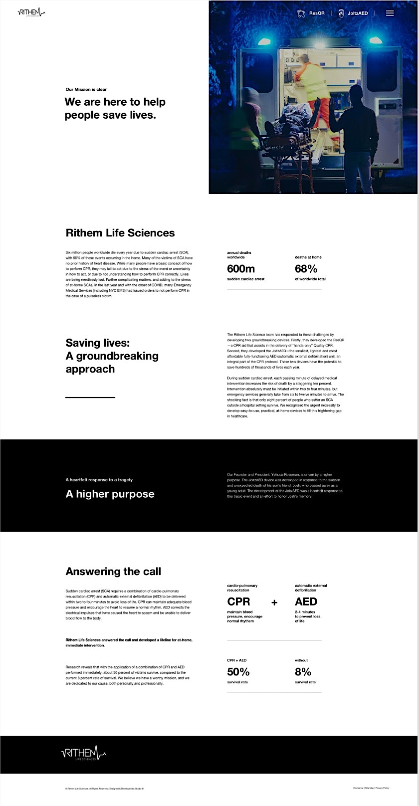
Design & Layout Marrying copy and imagery for a truly informative experience.

Communicating a highly technical product can be a bit of a challenge, so we relied on a combination of attractive breakdown imagery and informative, yet inviting copy to make the material as digestible as possible. A clean and open layout makes the information easy to take in, while a focus on avoiding overly technical language keeps things readable.

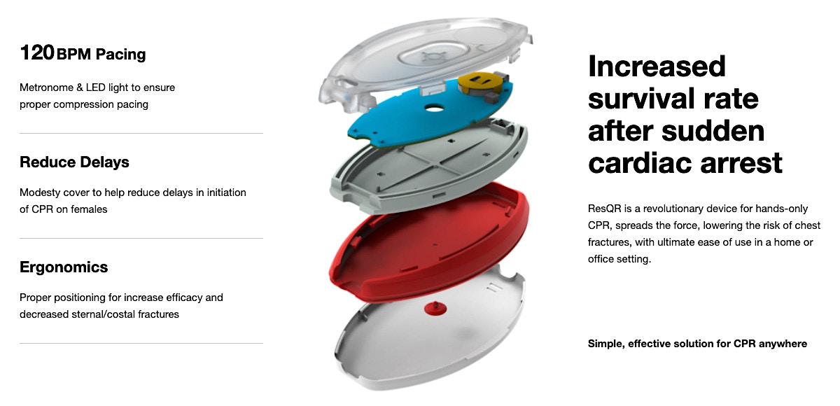
Technical Teardowns Utilizing teardown imagery to tell a story.

One of the best ways to help users understand how a product works is by talking through its component parts, so we developed attractive teardown imagery that lets visitors drill down into everything that make Rithem’s revolutionary products tick.

Encouraging users to take life into their own hands.

Branding Guidance, security, and approachability.

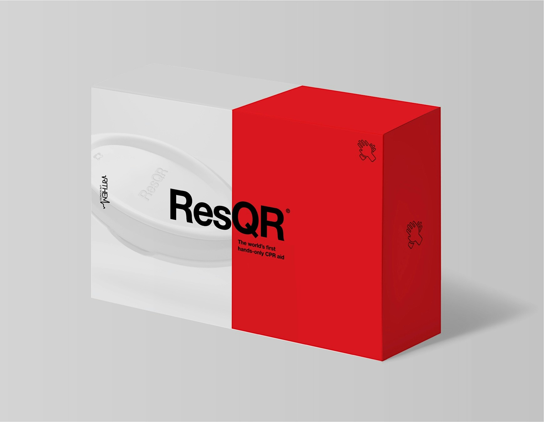
The ResQR product is designed to take the uncertainty out of CPR, providing the user with a calming and reassuring experience. We developed a look and feel that communicates these qualities, while also taking care to offer as much easily digestible information as possible.

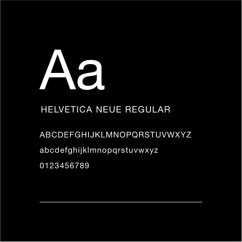
UI Guide | Style, Typography, Color Palette Building a safe, reassuring atmosphere.

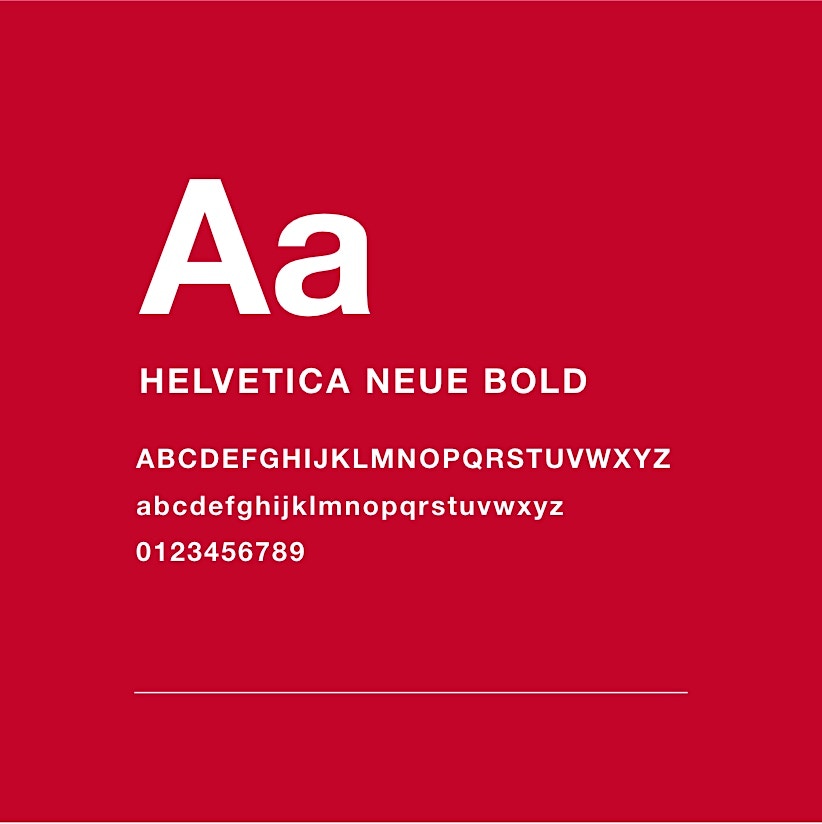
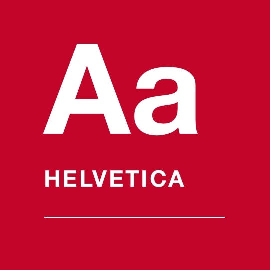
Mellow reds and plenty of whitespace, offset with calming slate greys, give this site a sense of modern refinement while also suggesting the idea of “medical rescue” with a white and red colorway. The Helvetica font family was chosen for its classic, easy-to-read, and universal nature.
B32620
000000
444444
F9F9F9

Branding Building an optimistic, forward-thinking voice.

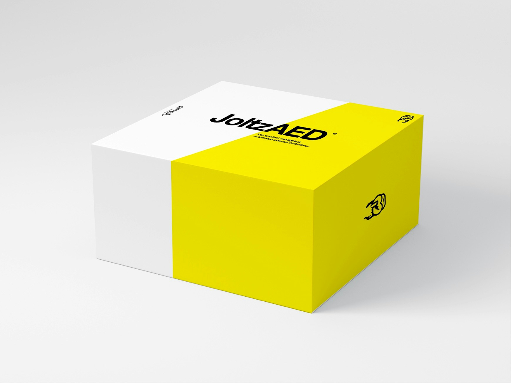
Designed to give people everywhere a new shot at life, the JoltzAED device called for a vibrant and optimistic voice. Relatively snappy copy and a yellow-tinged colorway give off hopeful feelings, while the yellow accents subtly suggest electricity.

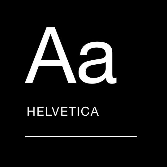
UI Guide | Style, Typography, Color Palette Creating a hopeful air of vibrancy and life.

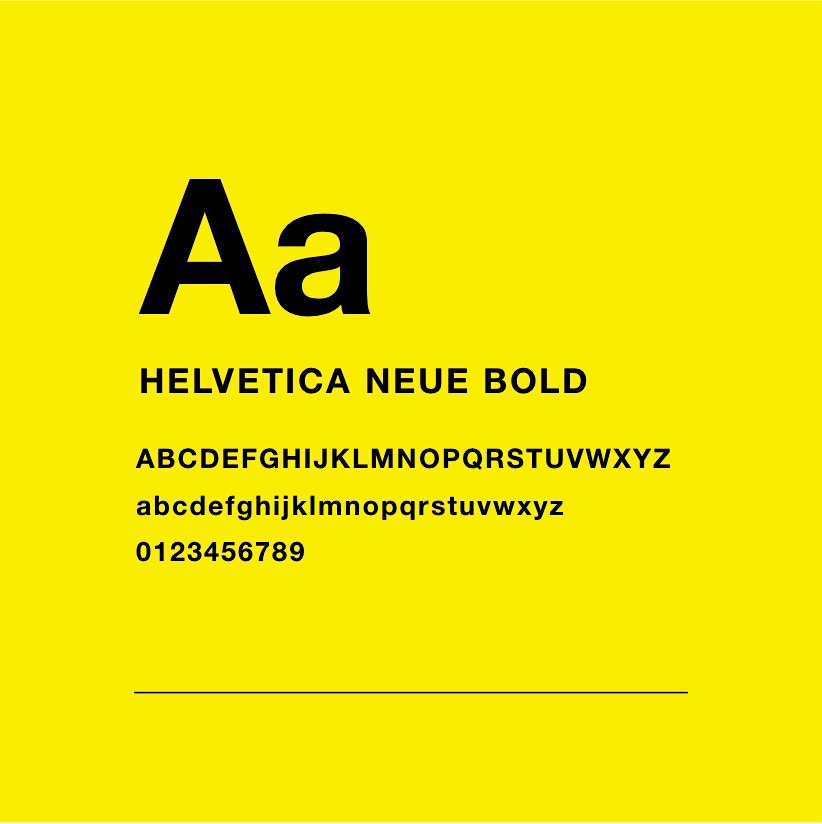
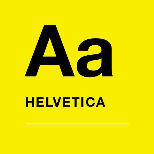
Simple blacks and whites enabled us to keep this site crisp and easy to read, while bold accents of yellow lent the affair an air of life and rejuvenation. The Helvetica font family keeps things timeless and readable, bringing the entire site together in an informative and direct way.
F7EC4F
000000
444444
F9F9F9
Contact Us Media

Have a specific question or just wanna chat?

This field is required.
Get in touch

Get on the good foot

Find marketing peace with our comprehensive accountable approach.

Give us a call!


(888) 351-3514

© Studio 3 Marketing. All Rights Reserved.

Terms & Conditions Privacy Policy Sitemap

Contact Us